Front End Development
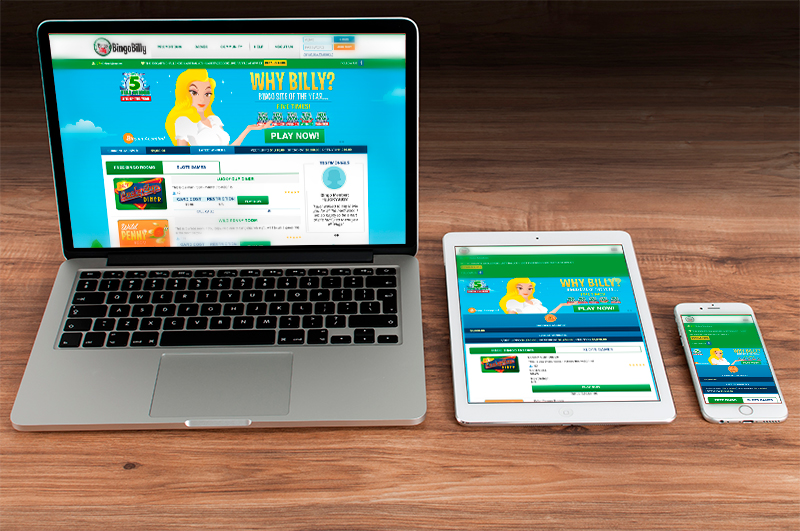


For that reason on this work, I had to take 3 websites that were done only for desktop, and change all the CSS to make every element responsive and fluid according the size of device. All of this without change or modify what it was designed in the past for desktop version.
I advice you I didn’t design these websites, I only work making changes on the code, css and making website friendly to whole devices.
On the next project I had to change the HTML, CSS and JS for Front-End because they were migrated from WordPress to CodeIgniter framework and make responsive one of them.
This important knowledge joins the visual image for the user with the backend programmed on a website.
Using HTML, CSS, Javascript with images, texts, and videos we can show to the user information that the transmitter, brand or business wants to display on the screen.
In the past, websites were displayed for desktop computer, but with time and technology advances appeared smartphones, tables and different devices with different screen sizes.
Front-End Development with this change has to adapt or redesign websites that could be shown with clarity, in a friendly way for users. Since websites designed for desktop were reduced on the screen on devices, texts were very difficult to read and images were streching.
Actually the front end development wants to show elements and information that users can look and read them easyly without distorsions in any device taking the same code source.
On the other hand, Google policies were pushing all websites to be responsive in order to get best rankings on the search engine listing, so this topic affects SEO results.